Skowyt poster
A poster for a Polish play inspired by Allen Ginsberg’s Howl and the beat generation.

Our Tempest poster
An original play about a group of students at an isolated writer's retreat working on an adaptation of Shakespeare's The Tempest as they struggle with their own issues, group dynamics, and climate anxiety.

Pesach card
A Passover card for the Jewish Community Center in Kraków.

Rumors poster
Play poster for Neil Simon’s Rumors. The director asked me to recreate Norman Rockwell’s painting “The Gossips” with photos I had taken of the cast.

"The Favorite"
Beer label I designed for my friend’s homemade beer.

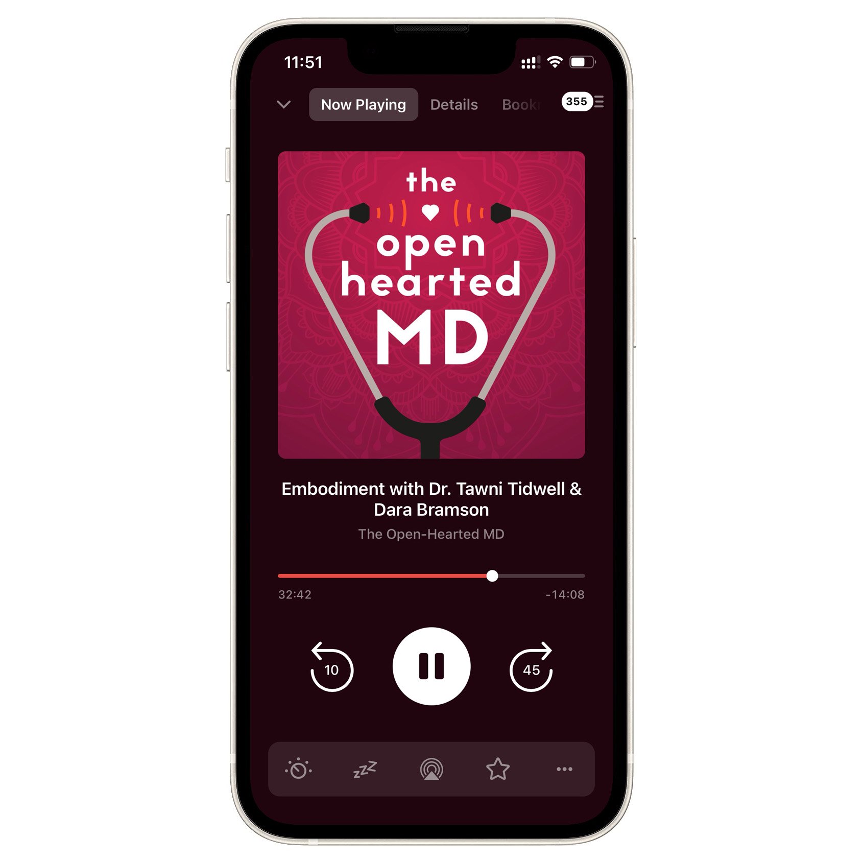
Open-Hearted MD visual identity
Cover art and logo for a podcast addressing the human elements of medical care.

Jentka children's book
I designed and illustrated this book, based on the life of a mayfly.

stamps
A small sample of stamps I have designed and produced. Some are for my own use, others were commissioned as gifts.

double deer
Shirts with my deer illustration to celebrate the bizarre double-bodied creature that perches on a building near Rynek Podgórski in Kraków.

Sqrut Point Jeans
Original logotype for a Polish fashion label. They make clothes and accessories out of recycled fabrics and other materials.

Street performance poster
Spec work for an annual festival.

Azimo office painting
Azimo’s Kraków office invited me to design a series of murals to decorate their office. In addition to the fanciful imagery in the hallway (floating islands, a tentacle from the deep) I also reproduced their logo (not shown) on a few walls locations. Below, left to right: (1) reminders before leaving the office painted next to the exit (2) “Rupee Room” signage for the conference room (3) “Shilling Room” logo outside of another conference room. All work was to use only their corporate colors and be visually consistent with their existing identity.

Transporeon networking invitation
Original photography done by me — the layout and design was based on a template used by the company.

International Women's Association Charity Ball
I produced posters and program cover to fit their “roaring 20s” theme. Type and skyline drawn by me.

Cat Head Branding
A system of stamps designed for my father’s home-roasted coffee.

As You Like It poster
… with my own hand lettering.

Toilets, Toast and Underpants book cover
In the end, Rob scrapped the title so the design had to be changed. But I was proud of the cover photo (I borrowed a stage gun) and the combination of film noir threat and vague absurdity that the cover conveys.

Arcadia play poster
… with original macro flower photography.

JCC Chanuka card
Their theme for the year was “change.”

50 Years of Theater STU
Spec design.

Winter's Tale poster
The production design of the play was divided in two, representing the two kingdoms — one inspired by summer, the other by winter.


